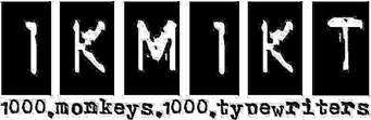
There's a thing that's been bugging me for some time. Unfortunately, the site's logo bears all those marks of jpeg compression. Or is it intentional design? Will it be possible in the future, to have a cleaner, crisper logo? It's not an urgent matter, just saying...
Re: 1KM1KT logo - blurrrrry
Posted: Mon Jan 27, 2014 9:29 am
by Chainsaw Aardvark
I was always under the impression it was supposed to be like that. An Homage to manual typewriters or the hand fed offset printers available to small concerns before the rise of desktop publishing. You would be surprised how hard hard making machine fonts in the early 80s was.
Re: 1KM1KT logo - blurrrrry
Posted: Sat Feb 01, 2014 4:36 am
by Rob Lang
I know where you're coming from. It's a bit of JPG compression and bit of the original font. Sadly, the original font has gone with the mists of time. This doesn't stop us from having a logo revamp at some point.